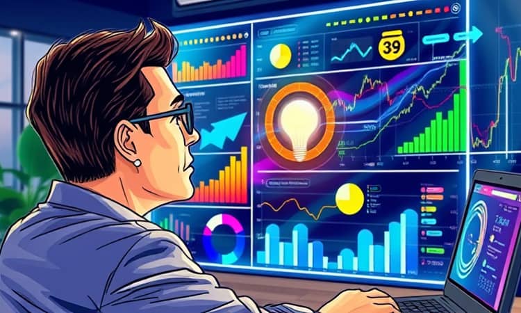
In the fast-paced world of finance, raw numerical data often remains a cryptic language, hidden in spreadsheets and reports.
Data visualization changes this by turning numbers into visual stories that anyone can grasp instantly.
It bridges the gap between experts and stakeholders, making complex concepts accessible and actionable.
Why Data Visualization Matters in Finance
Financial markets are incredibly volatile, with changes occurring in seconds.
Visualizations help professionals spot trends and risks quickly, enabling rapid decision-making that tables might obscure.
Interactive tools like Tableau and Power BI allow for on-the-fly exploration.
This supports real-time hypothesis testing and strategic adjustments.
Beyond speed, visualization democratizes financial understanding.
It makes intricate data comprehensible to executives, board members, and clients without technical expertise.
This improves communication in areas such as portfolio performance and long-term planning.
Many organizations still rely on static Excel reports for compliance.
Dashboards shift the focus from backward-looking reporting to forward-looking insight.
They facilitate scenario analysis and proactive planning.
The explosion of data sources adds complexity to finance teams.
Visual analytics integrates data from ERP, CRM, banking, and market systems.
It helps make sense of this high-volume, multi-source information.
- Speed of decision-making in volatile markets
- Bridging the gap between experts and stakeholders
- Moving from compliance reporting to strategic insight
- Managing data explosion and complexity
These points underscore why visualization is no longer optional.
It transforms finance from a number-crunching function into a storytelling powerhouse.
Key Use Cases: Turning Numbers into Narratives
Visualization applies across various financial scenarios, each with unique narratives.
Financial statements and performance dashboards visualize income, balance sheets, and cash flows.
They highlight metrics like revenue growth and margin compression effectively.
Sales and receivables dashboards focus on AR aging and collection risks.
Heat maps can instantly show where cash is trapped by region.
Purchases and payables dashboards analyze AP aging and payment forecasts.
Cash flow dashboards visualize inflows and outflows under different scenarios.
FP&A uses visuals for budgeting, forecasting, and variance analysis.
Waterfall charts explain step-wise changes, such as from prior-period to current-period profit.
Investment and portfolio analytics dashboards display AUM, asset allocation, and risk-return metrics.
They help in benchmarking and performance evaluation.
Risk management employs heat maps for credit risk and scenario testing.
Client advisory tools like Target-Maps visualize financial goals and gaps.
Regulatory reporting uses interactive visuals for macro indicators and transparency.
Operational analytics link expenses to outcomes, such as marketing ROI.
- Financial statements & performance dashboards
- Sales, receivables, and working capital
- Purchases, payables, and cash management
- FP&A: budgeting, forecasting, and variance analysis
- Investment and portfolio analytics
- Risk management and stress testing
- Client advisory and financial planning
- Regulatory reporting & transparency
- Operational analytics for finance
Each use case transforms data into actionable insights.
This empowers teams to drive better financial outcomes.
The Visual Grammar of Finance: Types of Charts
Choosing the right chart is crucial for effective storytelling in finance.
Different visual patterns serve specific narrative purposes.
Bar charts compare categories, such as revenue by region or cost by department.
Line charts show trends over time, like stock prices or cash balances.
Area charts display cumulative totals and contributions to a whole.
Pie and donut charts illustrate composition at a point in time, but use them sparingly.
Stacked bar charts break down components over time, such as cost structure.
Waterfall charts explain step-wise changes, ideal for budget vs. actual analysis.
Scatter plots and bubble charts reveal relationships, like risk-return profiles.
Heat maps use color gradients to highlight patterns in data like AR aging.
Treemaps show hierarchical composition, such as portfolio allocation.
Maps provide geographic views of metrics like revenue or default rates.
Gauges and KPIs offer at-a-glance insights into key metrics.
Network graphs visualize relationships between entities, such as counterparty exposures.
Parallel coordinates allow multivariate comparisons across dimensions.
- Bar charts for category comparisons
- Line charts for trends over time
- Area charts for cumulative totals
- Waterfall charts for step-wise changes
- Heat maps for pattern highlighting
- Treemaps for hierarchical data
- Maps for geographic insights
- Gauges for KPI tracking
Mastering this visual grammar enhances clarity and impact.
It ensures that financial narratives are both accurate and engaging.
Concrete Dashboard and Visualization Examples
Real-world examples illustrate the power of data visualization in finance.
Financial statement dashboards combine KPIs like revenue and net income with trend lines.
They provide a holistic view of performance at a glance.
Sales and receivables dashboards use bar charts and heat maps for AR aging.
This helps identify overdue invoices and improve cash flow.
Purchases and payables dashboards visualize spend by vendor and AP aging.
They support better vendor management and payment strategies.
Cash flow valuation dashboards, such as those from Qlik, show IRR by region.
They highlight areas below target for capital reallocation.
CAGR dashboards demonstrate time value of money and long-term growth.
They use dynamic visuals to show AUM and investment balances.
Margin analysis dashboards reveal drivers of profitability by region or product.
Risk-adjusted performance dashboards analyze loan portfolios with color-coded charts.
- Financial statement dashboard with KPI cards and variance indicators
- Sales & receivables dashboard with aging heat maps
- Purchases & payables dashboard for spend analysis
- Cash flow valuation dashboard for IRR tracking
- CAGR dashboard for growth narratives
- Margin analysis dashboard for profitability insights
These examples show how visualization turns abstract numbers into compelling stories.
They enable data-driven decisions that enhance financial health.
Implementing Data Visualization: A Practical Guide
Getting started with data visualization requires a strategic approach.
Begin by identifying key financial metrics that need monitoring.
Integrate data from various sources into a centralized platform.
Choose tools that offer interactivity and real-time updates.
Train your team on best practices for chart selection and design.
Focus on creating dashboards that tell clear, actionable stories.
Regularly update and refine visualizations based on feedback.
This ensures they remain relevant and effective over time.
This table helps in selecting appropriate visuals for common scenarios.
It simplifies the process of turning data into insights.
Embrace a culture of data storytelling within your finance team.
Encourage collaboration between analysts and stakeholders.
Use visualization to foster transparency and trust.
This drives alignment on financial goals and strategies.
Conclusion: The Future of Financial Storytelling
Data visualization is revolutionizing finance by making data accessible and actionable.
It transforms complex numbers into clear narratives that inspire confidence and drive decisions.
As technology advances, tools will become more intuitive and powerful.
This will further enhance the ability to communicate financial insights.
Start by exploring simple dashboards and gradually scale up.
Invest in training and tools that support visual analytics.
Remember, the goal is not just to show data, but to tell its story.
With visualization, finance professionals can lead with clarity and impact.
Embrace this shift to unlock new levels of strategic value in your organization.
Turn your numbers into narratives that shape the future.